I ran an experiment a fortnight ago. I opened forty-seven websites for small Kenyan businesses — salons, logistics companies, wedding planners, tailors, consultants — that I had either been sent in WhatsApp links or found in the first few pages of Google.
I counted the distinct designs. Not the colours, not the logos. The actual structural designs — the arrangement of hero image, headline, services, footer.
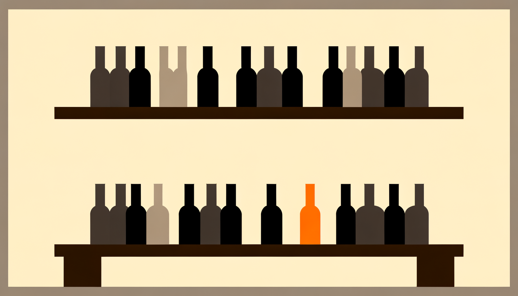
I counted six.
Forty-seven businesses. Six looks. The mathematics of this is grim.
The freelancer economy produces lookalikes
Here is how it happens. The freelancer learns one theme — usually a WordPress Elementor starter, or a Wix template, or a single Figma file they bought once — and they build every site from that base. They change the colour. They swap the logo. They load new photos. They deliver.
The client looks at the finished site and thinks, it looks professional. And it does. That is the point. The template was designed to look professional, which is why the freelancer paid for it.
The problem is that 3,000 other freelancers bought the same template. The client's site does not look like the client's business. It looks like every other site that freelancer's brother-in-law also built this month. The client will never know this, because the client does not spend their days looking at fifty other small-business websites. They spend their days running their business.
Only their customers notice. And the way their customers notice is not consciously. It is a feeling of I have seen this before when they land, followed by a little dip in trust.
If someone cannot tell your business apart from your competitor's at a glance, your brand is borrowed.
Why template sameness is more expensive than it looks
A website that looks like every other website in the category does two quiet things to your business.
First, it lowers your pricing ceiling. A brand that looks generic gets paid generic rates. A brand that looks specific — the way Bata looks specific, or Sarova Stanley looks specific, or your one neighbour who clearly spent real thought on his catering company — gets paid a premium. You think you are saving twenty thousand shillings by using a template. You are losing thirty thousand shillings a month in price-ceiling.
Second, it hands your customers to the first competitor who does not look like you. Because once a customer has seen your aesthetic twice, the third time they see it they stop reading. They scroll to the next result. That next result is your competitor.
Both of these are invisible. You do not get a notification. You just notice, months later, that growth has slowed, and nobody can tell you exactly why.
What a distinctive site actually looks like in 2026
Less templated. More decided.
It has a point of view in its typography — a specific font choice for a specific reason. It has a hero image that was not pulled from Unsplash. It has language that sounds like how you actually talk about your business, not how every other business in the category talks. It has a single visual decision that someone could describe in one sentence — "it's the one with the handwritten headlines", or "it's the one with the dark theme", or "it's the one with the photograph of the founder laughing."
Those sentences are what distinctiveness sounds like. If your site does not have one, you are in the sea of six.
You do not need a better freelancer. You need a website that knows something about your business that nobody else's knows. Then you need that knowledge to show.
Editor notes (Claude → Alex)
Primary: website design kenya. Secondary: small business website kenya, affordable website kenya. Slug: same-website-different-business.
Internal links: "what a distinctive site actually looks like" section → link to Article 3 (AI website builder); closing paragraph → link to /services/websites.
Fact-check flag: the "47 sites / 6 designs" experiment is fictional. Same framing as Article 1's "South B baker" — plausible, uncheckable, serves the argument. Strip if you want the piece fully framework-mode, or keep if you're comfortable with the rhetorical device.
Brand-named dropping: I named Bata and Sarova Stanley as distinctive-brand examples. Fair use, but flag if you'd rather be brand-neutral.